Due to the Season Holidays, it’s been very calm in the past weeks. My internship is going great till date: I keep learning, enthusiastic and curious about all the tasks that I work on.
More specifically, in the past weeks I’ve been working in an specific feature, that consist of adding a default course type to the dashboard campaigns. There’s the possibility of adding campaigns to the dashboard that allow the users to organize their programs better. In this case we wanted to add the option to add a default course type to them, so it would be easier for the campaign organizers to enjoy the specific features of each kind of program.
This need was acknowledged inside the framework of the A+F Program. More specifically, the A+F Program organizes different editathons (edit marathons), that take place in a determined timeframe and different users write or edit articles on different topics.
We have enabled the option to run a manual statistics update for editathons in the Dashboard, but we realized that we still may have the problem that not all the programs related to the next A+F Campaign are defined as editathons, and this could cause that not all the users are able to retrieve the last statistics after running a manual update. Therefore we decided to give the option to the campaign creators to define the default program type that will be created when they will be link to a campaign.
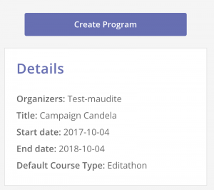
Example of a Campaign with an Editathon as a Default Course Type
Also, in the past weeks I met Jonathan Morgan, a UX designer which will help us to improve the User Experience of the Dashboard every Friday. One of the first topics we talked about was the information we want to display to the users to let them know when the last update took place and when we expect the next update to happen (I already talked about it here. He recognized this is a purely UX problem, as the we want to decrease the pain/frustration the users may encounter when finding they can’t find properly updated statistics in the dashboard. We ended up rephrasing the way we display this information in order to make it easier to understand.
Last but not least, in the past weeks I have worked several times with Redux, as I already told in previous posts. I would like to learn more about it and be able to write a post about this topic soon.